UX/Product Designer
EatBuddy - A Meal Reminder Mobile App
EatBuddy is a mobile application that aims to give users an on-time, high-quality, and interesting eating experience. It provides users with more incentives to continuously use the application to earn rewards and unlock more functionalities.
In our interaction design course at the University of California, San Diego, I worked with two teammates to design this gamified meal-reminder application to address a prevalent health problem: irregular diet. I was primarily responsible for conducting user-researches to understand user needs and designing user interfaces to address the unmet needs.

Design Software
Adobe XD, Photoshop
Technology
Year
HTML, CSS, Javascript
2020
Problem
Due to the fast-paced life and high pressure of work, people often skip meals or eat late. Irregular diet can cause serious health issues. However, existing products today fail to provide users enough motivation to keep using so as to grow a habit.
“31 Million U.S. Consumers Skip Breakfast Each Day because they didn’t feel eating or drinking or they didn’t have time and were too busy.”
- Reported by NPD Group
“Having irregular meals may set you up for obesity, high blood pressure, and type 2 diabetes — regardless of how many total calories you’re consuming.”
- Maria Masters
Needfinding
Before we start to design our product, we wanted to know more about how many people have experienced irregular diets, like skipping meals or late-night meals. We assumed our target audiences would-be university students and new graduates who either full-time or work for an internship. We are also interested in the reasons why people skip meals and when they would skip meals. We sent out surveys and conducted interviews to better understand our target audience. Some questions we interested were:
-
When was the last time you skipped a meal? Why did you skip that meal?
-
Tell me about your eating habits, like when would you have your breakfast, lunch, and dinner?
Based on our interview and survey results, 44 out of 51 of our participants said they have skipped meals recently and 5 participants said they did not remember whether they skipped a meal. The most common reason for skipping a meal is that they are busy doing something so they forget to take the meal or they are too busy to take a meal (e.g. having a class that starts at lunchtime, skipping dinner to study for midterms).
Thus, based on the results we had, we believe skipping meals is a severe problem that most college students/graduates have faced. My team and I want to design a mobile app to remind and provide people more incentives to regulate their diet.
Storyboards


User Persona

Draco
Male 22 years
Job: machine major graduate student who currently has an internship in a local technology company
Behavior: He spends about 12 hours on coding every day so he often eats very late. He does not know cooking so he often goes to Mcdonald's and picks up his dinner at midnight.
Hermione
Female 20 years
Job: third-year music major undergraduate
Behavior: she spends at least 8 hours on building her portfolio and preparing application documents. She is stressed and busy so she often skips lunch or dinner to keep working.
Goal: stop eating late-night meal and regulate daily diet
Goal: release stress and regulate diet, take meal on time
Competitor Analysis
Based on our interview and survey results, we also found out that some people have already tried to use some mobile applications to regulate their diet. However, most of the people did not use an app that is dedicated to diet regulation to regulate their diet. Instead, they are likely to set up an alarm to remind themselves when it is time to eat. However, most of the people only set up the alarm for once or twice. Our team believes there is some design space for us to help people regulate their diet by providing motivation to keep using meal reminder apps.
Competitor Analysis Table
Paper Prototypes & Wireframes
We started to draw out our designs on paper. We designed two different interfaces at first and we decided to implement the first one because the second one looks similar to existing products and it lacks incentives for users to keep using the application. For prototype 1, we designed a virtual pet to eat with the user and the health rate of the pet would be determined by the user’s eating habits. We believe that since our target audience is young adults so they would be more willing to use a gamified application.
Based on the paper prototype, we started to create wireframes in Adobe XD.


Alternative Designs
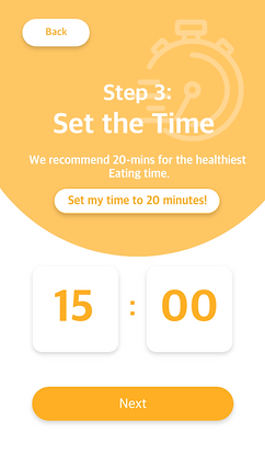
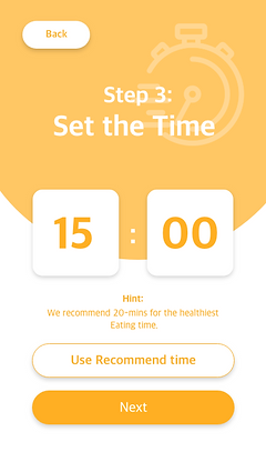
Based on the feedback we received in user testing, we did four different versions of the design for the timer page. The main differences across designs are the position of the instruction, the position of the “recommended time” button, and the way of input for setting time (click vs. type).
We chose to use Timer Design 1 and Timer Design 2 to conduct A/B testing because the design of the timer is the most confusing and problematic part for our users. According to the user test results, most of our users found that setting up the timer by clicking is difficult because it takes a lot of time to go to the right number. Thus, we changed the input of the timer which allows users to directly type the number they want. We assume this would save users time on setting the timer so we used Google Analytics to test our hypothesis.
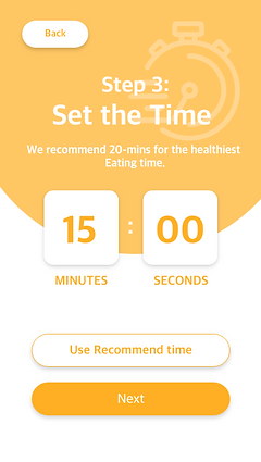
Timer Design 1

Timer Design 2
Timer Design 3
Timer Design 4
Google Analytics Results:
Our Google Analytics Results support our hypothesis. It shows that people would stay on the timer page for 49 seconds on average with the type-in design and 3 minutes and 7 seconds with the clicking design. We believe the type-in design could maximize the efficiency of use.


Final Product
After 10 weeks of designing, testing, and redesigning, we finished implementing this brand-new Meal Reminder application. We promoted our product on social media like Instagram, Wechat, and Youtube Channel. Our product has been widely noticed. According to the Google Analytics data we have on March 10, more than 200 users started to use our product and they provided us with valuable feedback.
User Testing
After we finished implementing our first prototype, we asked people to use it and to tell us how they feel about our prototype. The target audience of our product is college students and new graduates so our test sample is also chosen from college students and new graduates. We set up a few user tasks and design questions we were interested in before user testing.
User Tasks:
-
Create an account and choose a koala as your EatBuddy. Give your EatBuddy a name.
-
Choose a bone for you Eatbuddy and start a 3-minute meal.
-
Check the health status for your EatBuddy when you finish the meal.
-
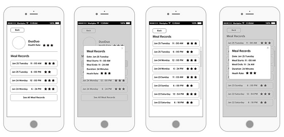
Check the detailed meal record for the meal you just finished and log out.
Three Key Design Questions:
-
What did users like/dislike about the gamified interface (e.g. animal faces, pet foods) compared to traditional reminder applications (e.g. alarm, to-do list)?
-
How do users feel about the health rating system? Do they feel the rating system provides them enough information about their diet? Why or why not?
-
Does the lack of navigation bar cause confusion or inconvenience to users? If so, when would users encounter difficulties because of the lack of navigation bar?


General patterns:
All three participants found that the timer is inconvenient to use because the arrow button is hard to click and the user has to click dozens of times to get the desired number. All three participants were confused about how the health rating system works because there was no clear explanation or documentation to help users understand. Two participants ignored instructions on the Choose your food page. The reason that participants have these patterns is that the timer does not function as users expected and there were not enough instructions for them to understand the task fully.
List of changes:
-
Redesign the timer: making it scrollable or accepting typed numbers.
-
Add help pages to clarify how the health rates are calculated and how to improve your health rates.
-
Adjust the font size and layout for steps in the “Start Eating” process to make instructions more clear and noticeable.
-
Add pictures of food to meal records and remove the repetitive health rates.